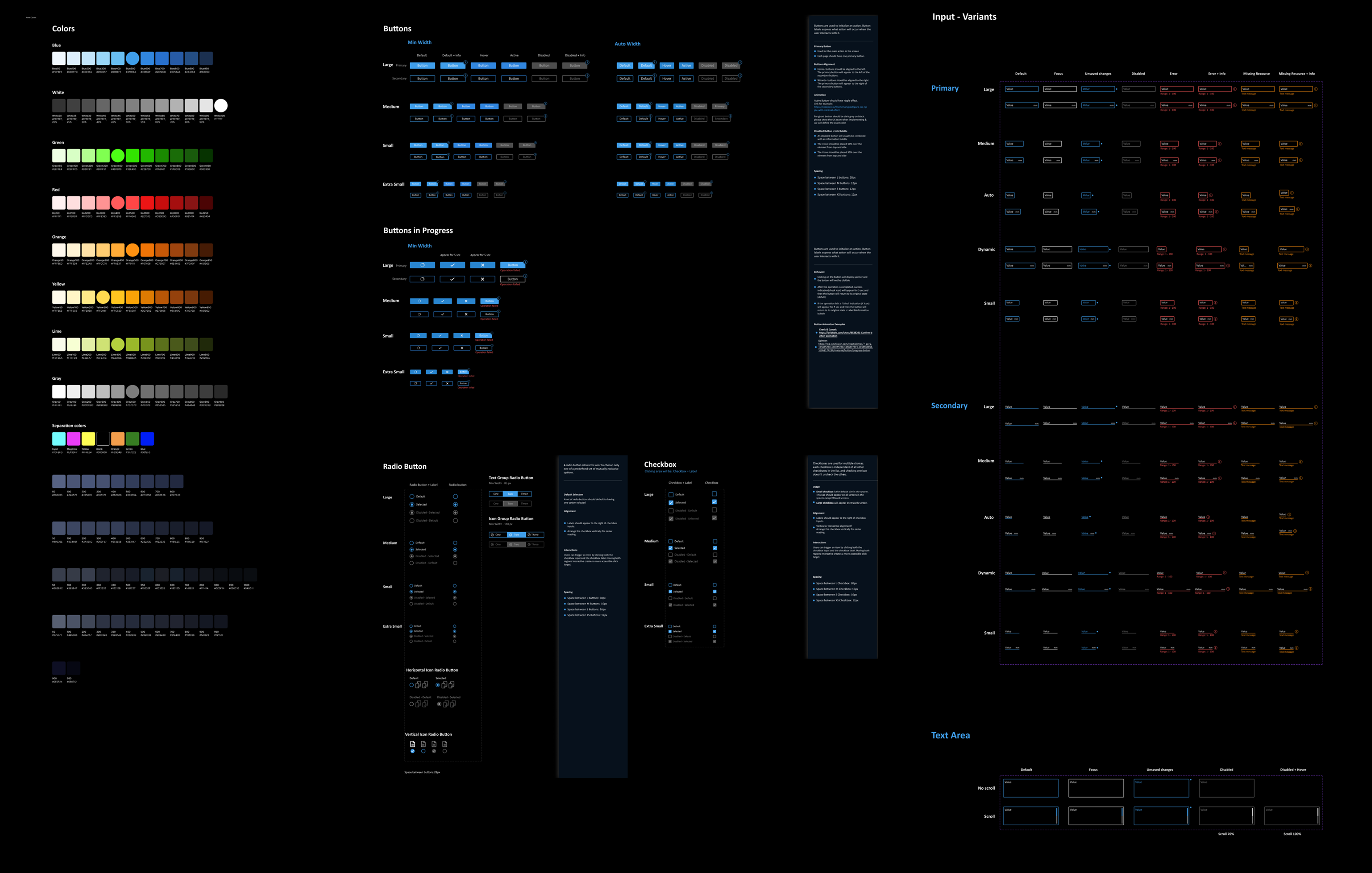
Define the experience for Landa's Nanographic® Printing Presses operating system.
This feature enables non-stop printing by eliminating downtime between jobs, making short-run production faster and more cost-effective.
The existing press operating system was missing a standard feature in the industry - continuous printing capability. This absence led to significant downtime between jobs, reducing press utilization and productivity.
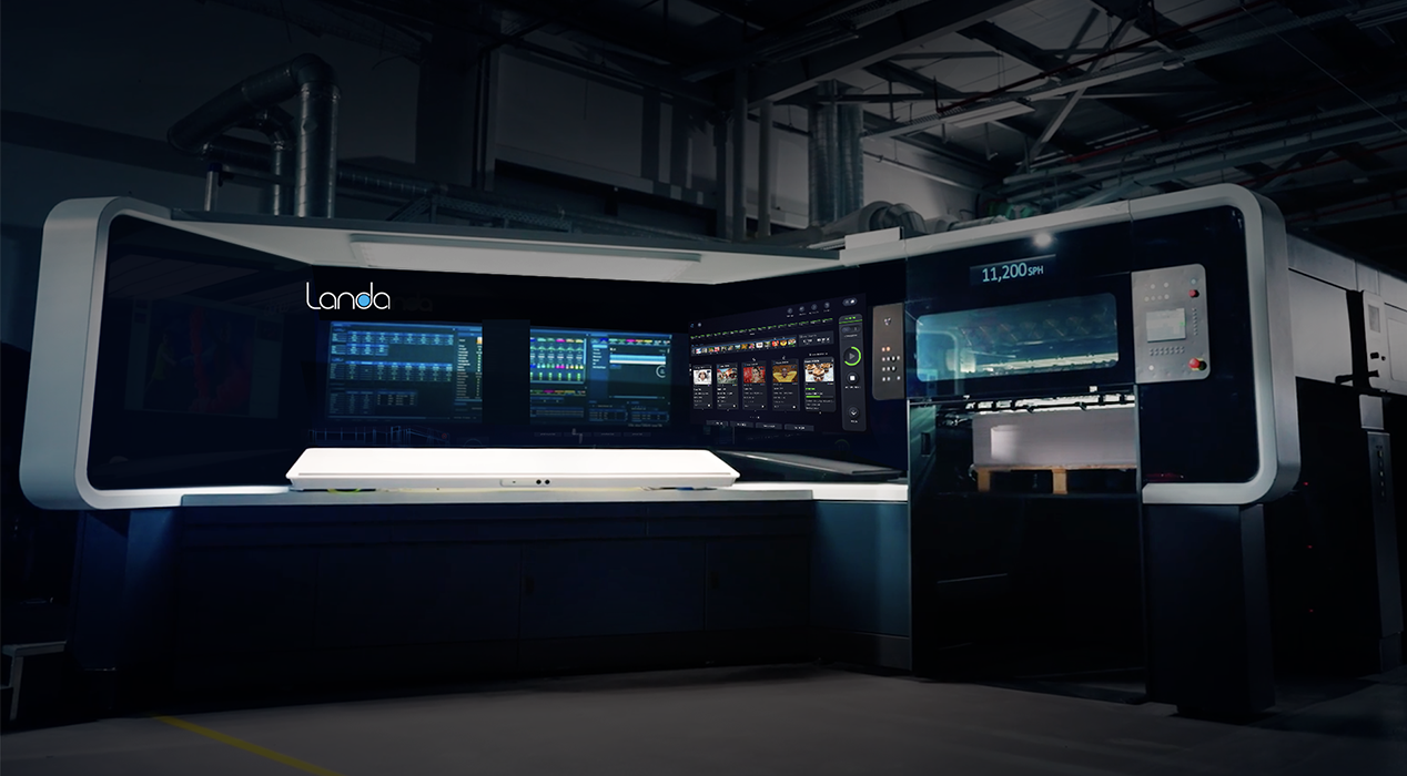
The interface was not optimized for short-run production workflows, which require rapid job switching at high speed. Operators faced high cognitive load with too many visible actions and distractions, making it difficult to maintain focus during critical operations.
Additionally, the main screen had an outdated appearance and was built on deprecated technology, creating both user experience challenges and technical limitations that motivated the development team to pursue an upgrade.
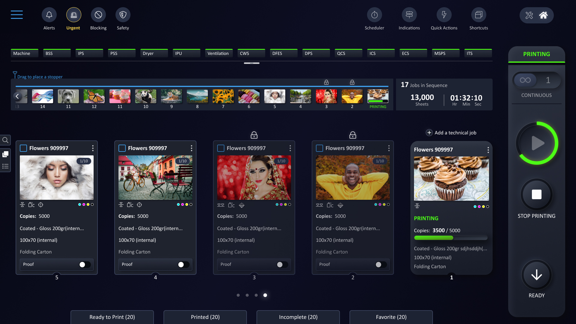
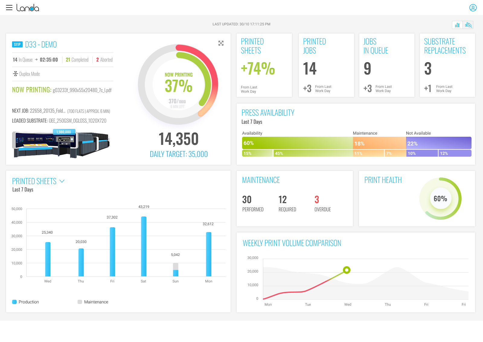
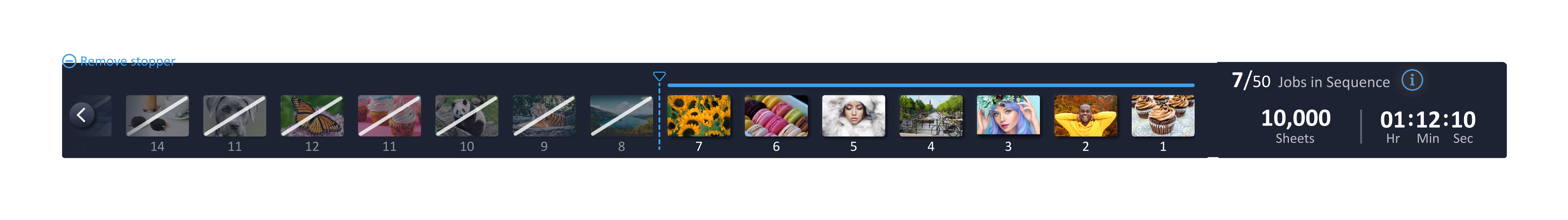
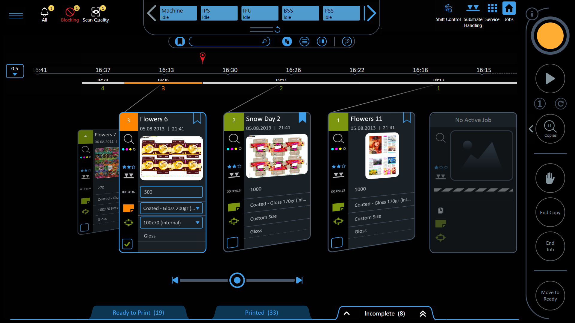
Visual representation of upcoming jobs in the queue, helping operators plan ahead. Includes a stopper element to control the continuous sequence.
Overview of the current sequence and estimated completion time, providing operators with essential information at a glance.
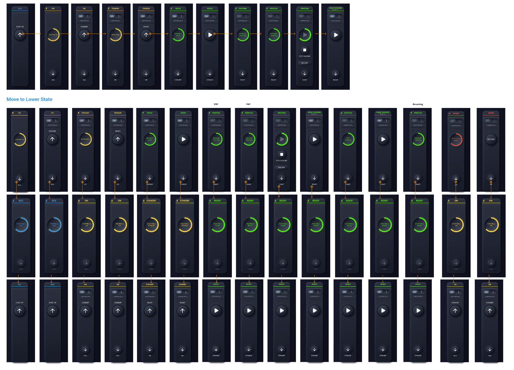
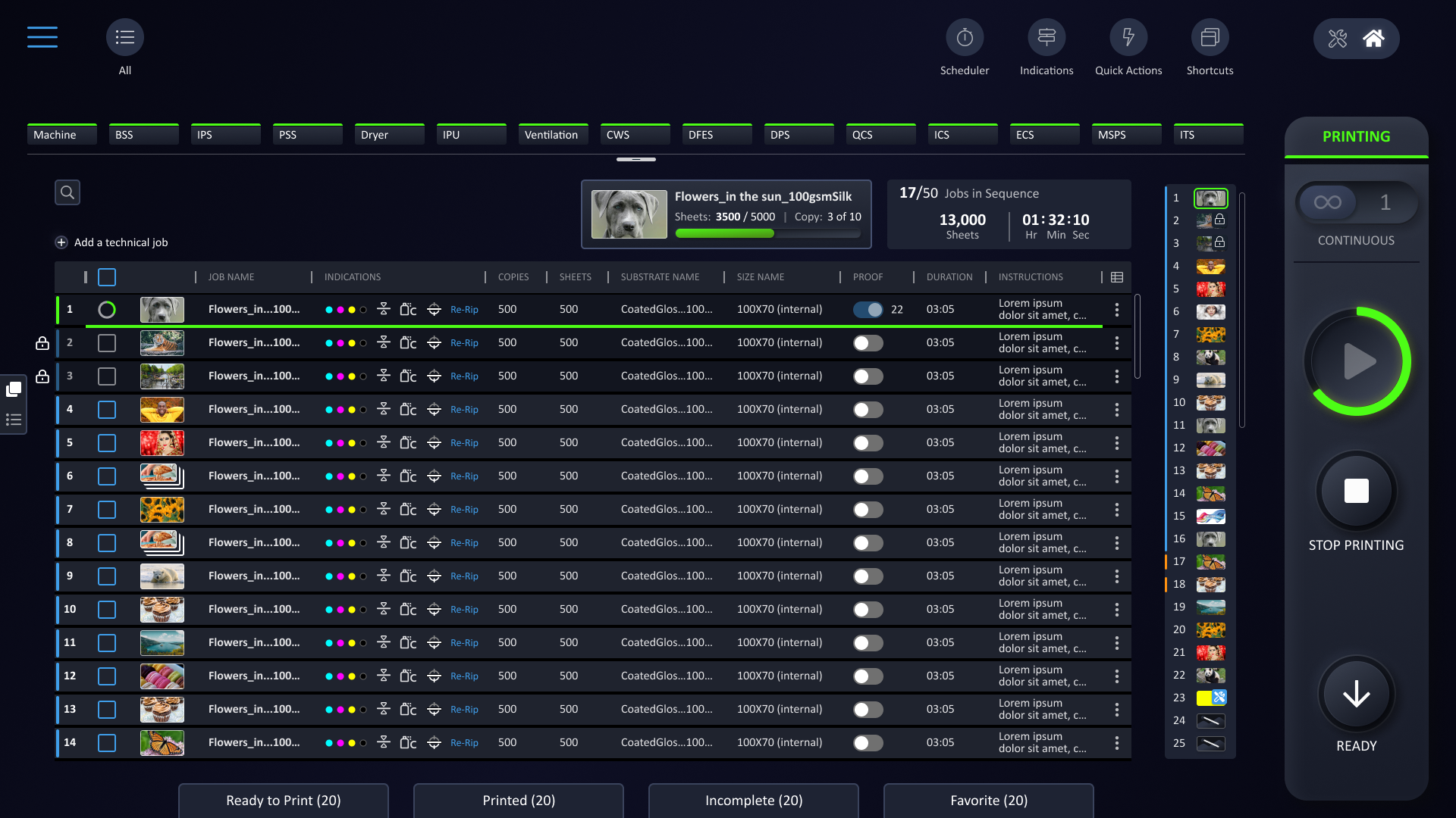
Redesigned for intuitive operation, defined to display relevant actions per state only.
Due to the high speed of the press and jobs streamming, a technical limitation prevented certain jobs from being stopped or modified. To address this, a locking mechanism was introduced, ensuring that once a job reaches a certain stage, it is secured against edits to maintain system stability and prevent errors.
adding unnecessary friction and causing users to second-guess their choices.
The hand icon stood out visually and was often assumed to be the main stop function.
While it did stop printing, it also dropped the press into a lower operational state, making the recovery time-consuming.
Unnecessary delays in production.
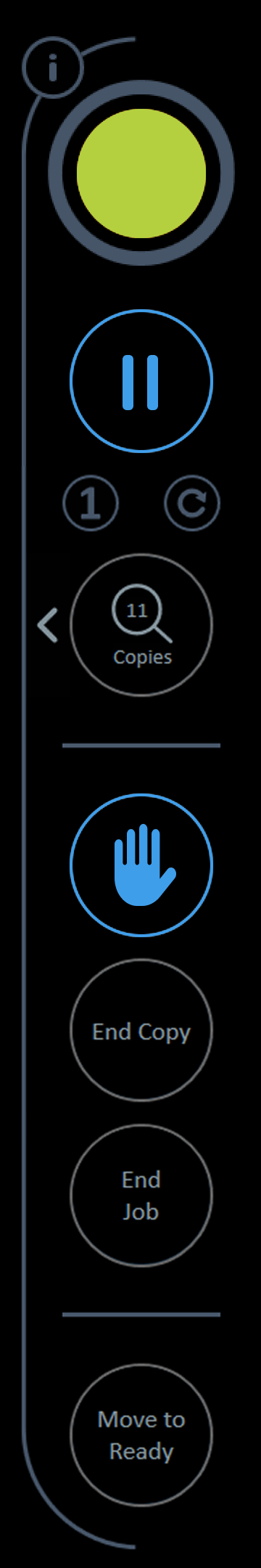
The new print control displays relevant actions per state only.
The confusing hand icon was replaced with an arrow pointing down, to clearly indicate the press downwards state change.
Based on usage data, actions that were rarely used were eliminated.

Since the job card carousel only supports the display of 5 jobs at a time, and the fact that short runs usually result in a large number of jobs, we wanted the user to have an anchor that gives him a preview and a better understanding of what the sequence contains.
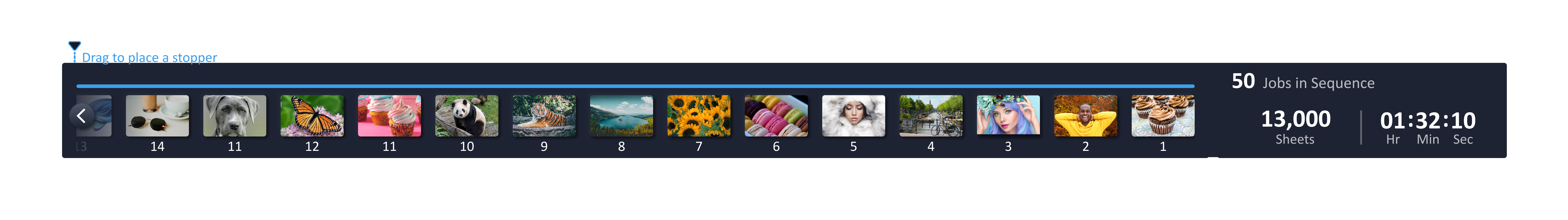
The Timeline is a minimized view of the carousel. It contains the stopper element that can be added by dragging it to the timeline.
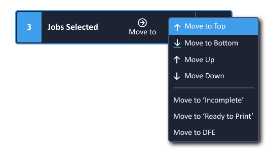
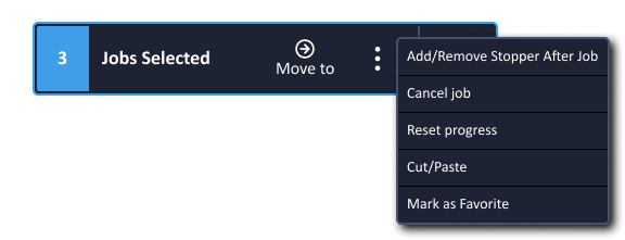
Selecting more than one job (by checking the job checkbox) will display a floating pop-up allowing the user to perform actions to multiple jobs
Main Screen - Before
Main Screen - After