Data platform for press analytics that enables users to monitor real-time and historical data from the cloud-connected printing presses.
Transforming press data into actionable insights for optimal press performance.
Designed, developed and launched within a year.
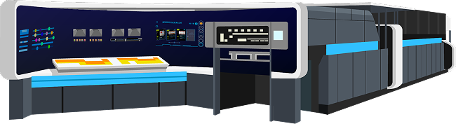
Landa's printing presses continuously report vast amounts of data to the cloud. However, there was no effective way to display this information in a clear, accessible way.
Both the company's internal teams and customers were struggling to make sense of the raw data.
Without a proper visualization platform, stakeholders couldn't identify patterns or gather meaningful insights that would help optimize press performance.
Interviews with key stakeholders were conducted to understand their needs and goals
Who oversee the production process and need to track production data for single/multiple presses
Who need to view performance across multiple sites, regions, and product types.
The platform is used for billing purposes, tracking usage data to generate accurate invoices and manage customer accounts.
Identify consumables usage patterns and predict consignment needs, enabling better inventory management and cost optimization.
Analyze performance data to identify areas for improvement and optimize production processes.
Who need comprehensive data to identify press issues, diagnose problems, and perform maintenance. They require access to historical performance data, error logs, and detailed metrics to troubleshoot effectively and prevent future breakdowns.
Production Manager (External Stakeholder)
Ensure that the printing presses operate efficiently, maintain high production levels, and stay in good working condition. He wants to receive real-time updates on performance and historical insights to optimize his press performance.
Operations Manager (Internal Stakeholder)
Oversee production efficiency, resource allocation, and strategic performance across multiple printing presses. She uses the platform to identify areas for improvement, generate reports for senior leadership, and make high-level decisions.
| Goals/Tasks | Production Manager | Operations Manager |
|---|---|---|
| Real-time monitoring of data | Views live metrics for operational decision-making. | Reviews overall performance of all presses across locations. |
| Identifying anomalies/alerts | Reacts to real-time alerts for downtime or performance drops. | Receives notifications about critical operational issues. |
| Analyzing historical data | Analyzes historical data to identify trends, such as production peaks & lows, ink usage | Uses historical data to assess long-term performance and strategic impact. |
| Reporting and stakeholder communication | Generates reports for team discussions or maintenance reviews. | Generates high-level reports for executives and leadership teams. |
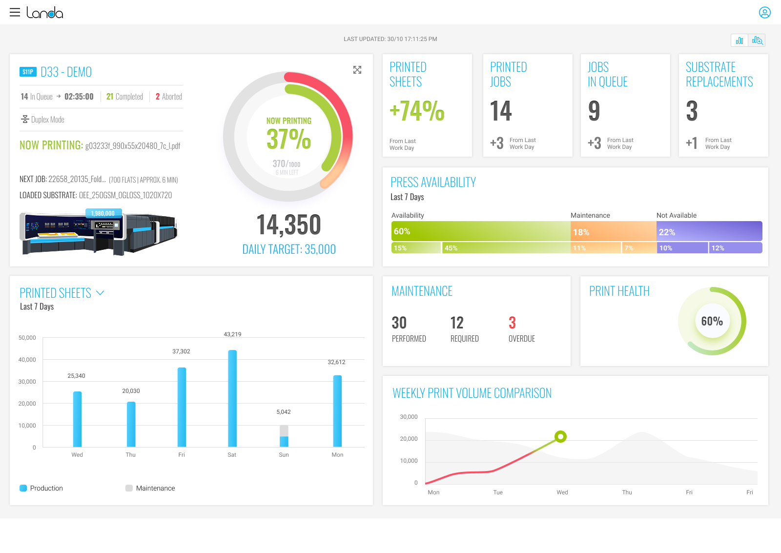
 Duplex Mode
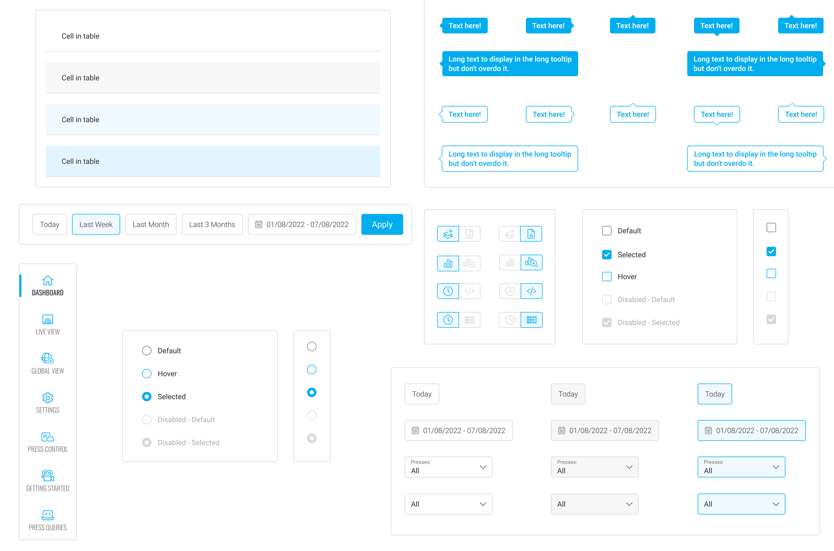
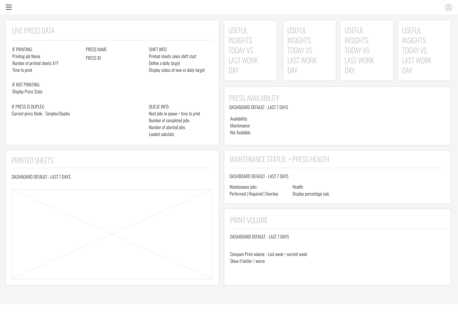
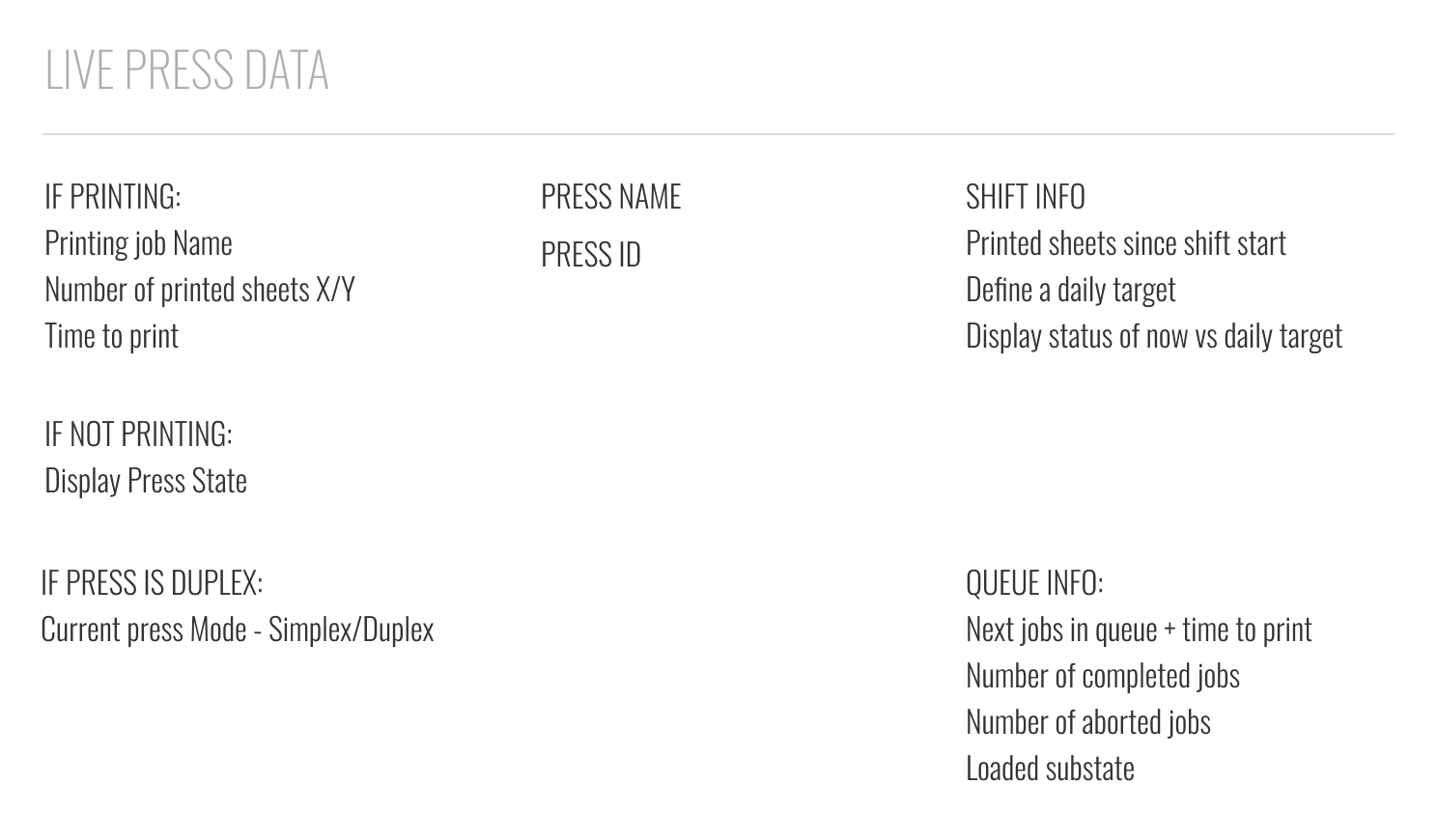
Designing an interface that balanced displaying vast amounts of data with simplicity and usability for different user types.
Handling large volumes of live data from multiple presses with quick loading and seamless updates.
Creating a flexible interface that addressed distinct needs without overwhelming users with irrelevant information.
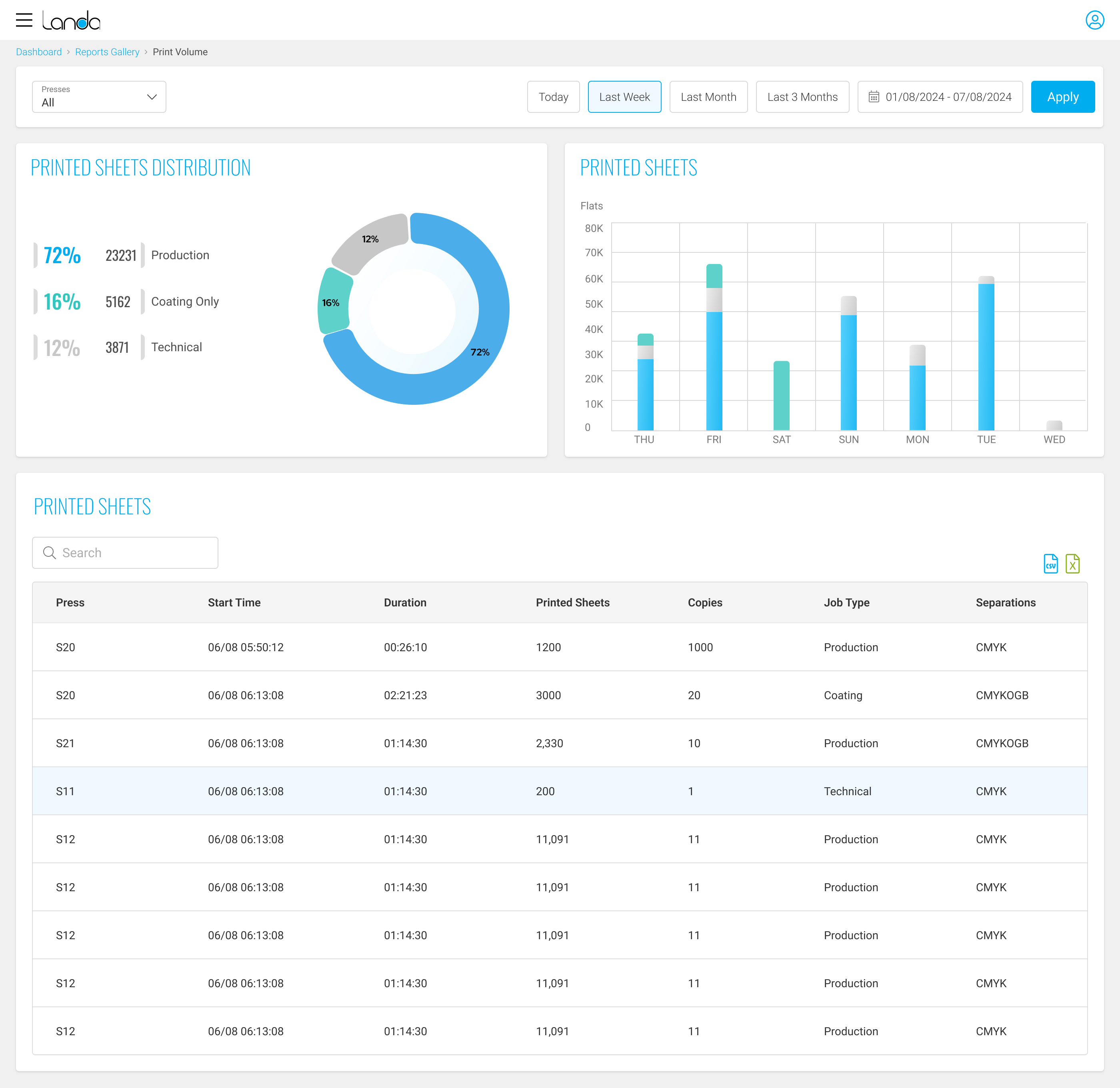
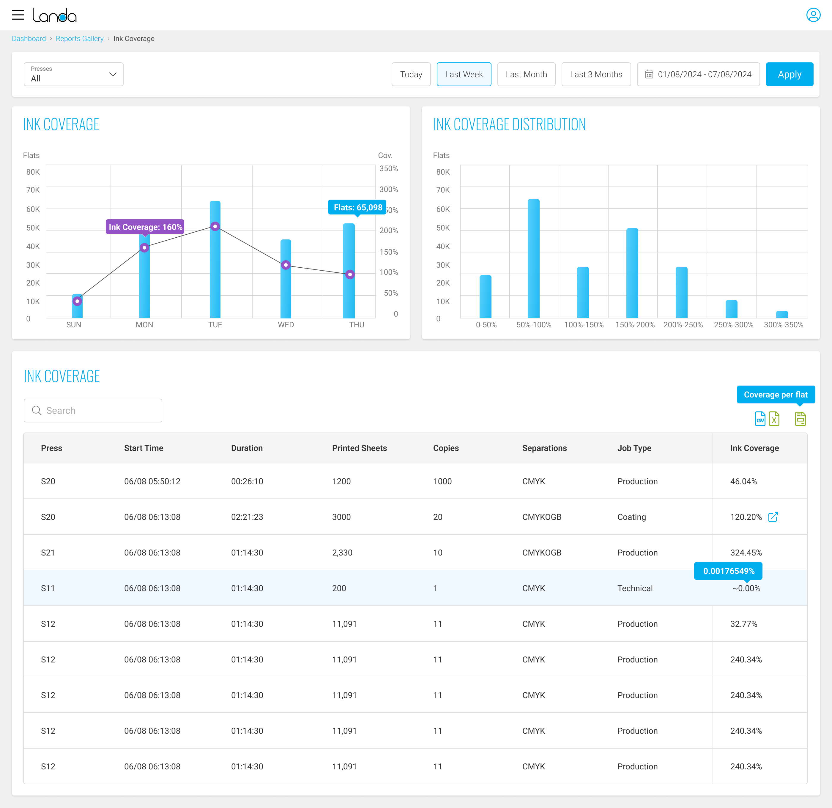
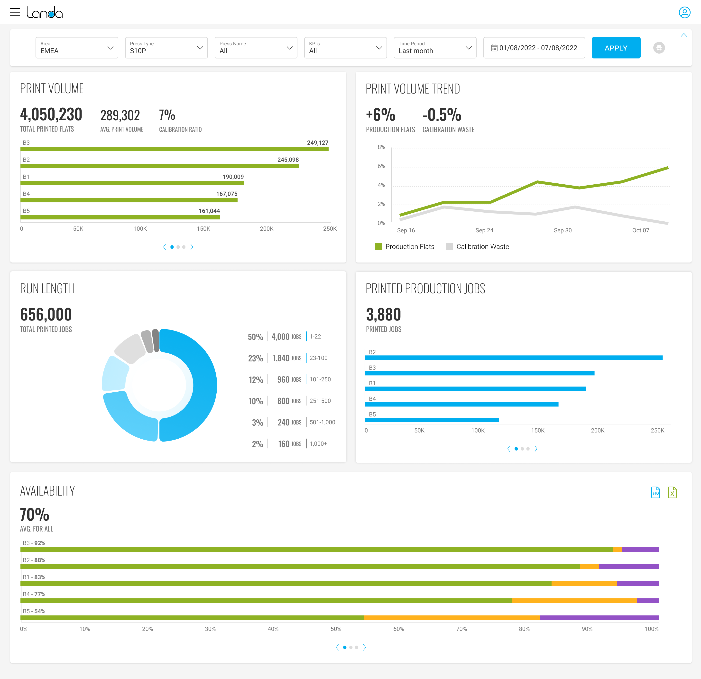
Designing graphs and charts that conveyed complexity while remaining easy to interpret.
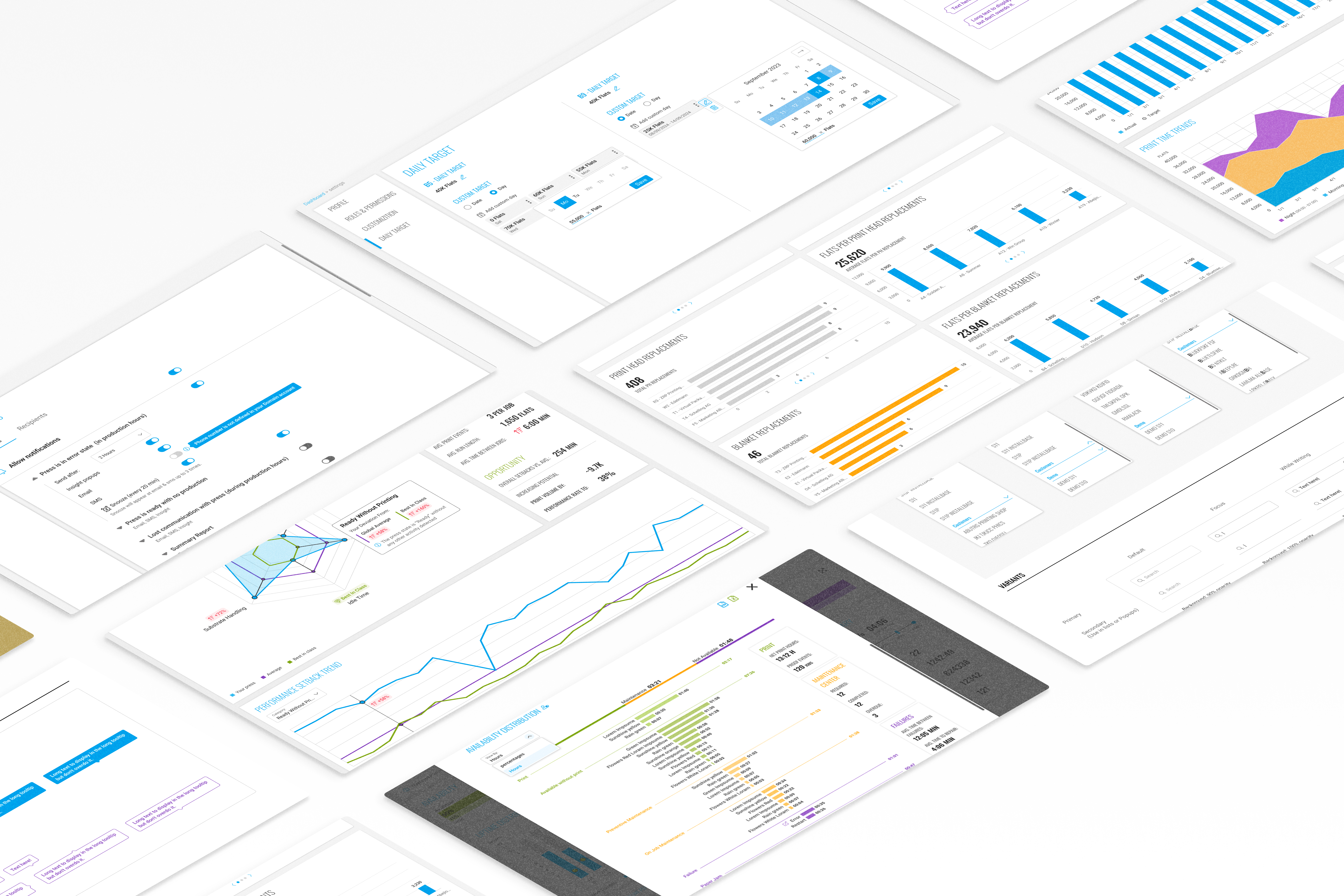
Interactive visualizations with intuitive graphs, charts, and color-coded metrics that simplified information without losing detail.
System designed to load data quickly, process updates seamlessly, and maintain responsiveness with large volumes of live information.
Role-based access with simplified dashboards for basic users and detailed analytics for advanced users.
Interactive charts and dashboards that allowed users to explore historical data intuitively and identify patterns.
The platform achieved over 80% adoption rate
leading to a major reduction in manual press monitoring, freeing up valuable time.
With clearer, more accessible data, the company was able to significantly reduce machine downtime
Post-launch feedback confirmed strong user satisfaction,
particularly around improved access to operational insights and ease of use.